Runnr-Branding
Creating a new brand identity for a delivery service
Roadrunnr, a hyperlocal B2B logistics provider, acquired food ordering firm TinyOwl and rebranded themselves as Runnr. While TinyOwl had the technology in place to generate demand for restaurants, Roadrunnr had a strong delivery fleet. The acquisition helped build a strong full-stack service.
Branding Brief
The brief was to create a brand that signified fast delivery but was also amicable and trustworthy - this was a clear departure from TinyOwl’s narrative of hassle free food ordering and was more focussed on delivery.
Me and my team worked closely with the founders to define an identity for Runnr. We thought of the various touch points where users would interact with our brand to define a comprehensive brand direction. It gave us an opportunity to view every consumer contact with the brand as an opportunity to enhance our brand value.
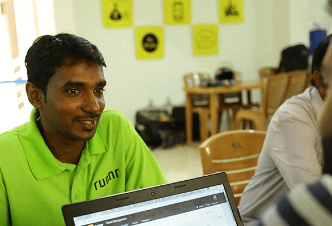
For inspiration we looked at our delivery crew, whom we called Runnrs. They were the face of the brand while interacting with customers as well as partner restaurants and hence our true brand ambassadors.
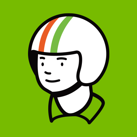
THE LOGO
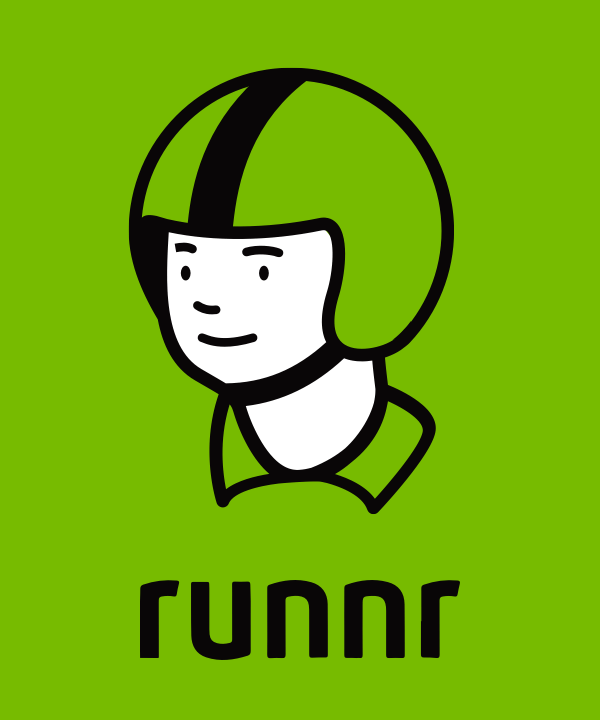
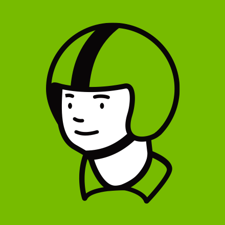
The proposed logo was a friendly and approachable character representing a Runnr (delivery boy). The racing stripes on the helmet added a dash of speed to the character and helped in making it stand out.
We chose bright green as the primary brand color signifying freshness and fulfilment-apt for a brand that’s new and fulfils thousands of orders each day. Using a character also helped differentiate Runnr from its competitors-Swiggy and Zomato-who used abstract shapes and logotypes as logos
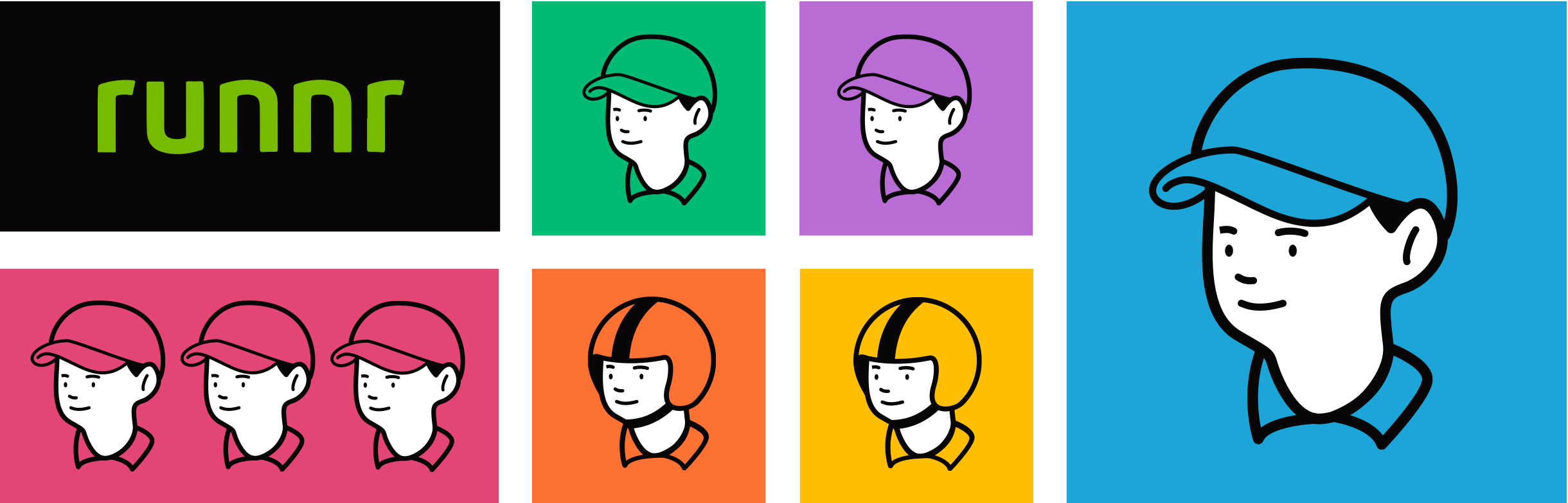
Using a character not only humanized the brand, but also provided the scope to play with colors and launch more services in the future. Different colors can represent the range of services offered by Runnr.
Furthermore, it also provided the flexiblity to use the character for our campaigns.
Default
Independence Day
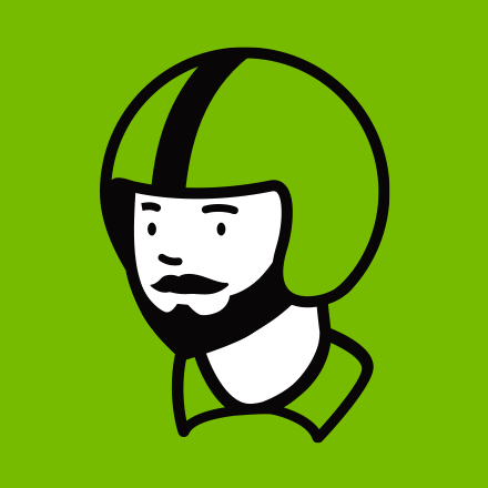
No Shave November
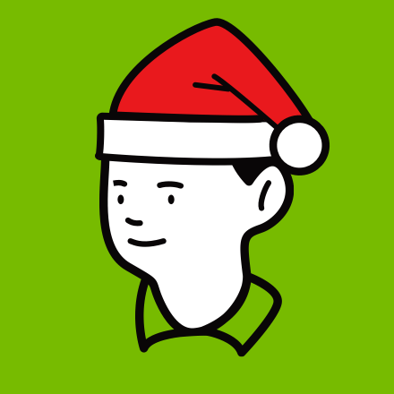
Christmas
We needed to go beyond the narrow view of thinking of a brand as just a logo or a label. The logo and the values needed to reflect in the delivery crew. We made the Runnr uniforms in bright green to ensure that our Runnrs stood out in traffic.
The sporty stripes on the helmet were complemented with stylized jackets to give a sense of speedy delivery.
LIVERY AND UNIFORMS
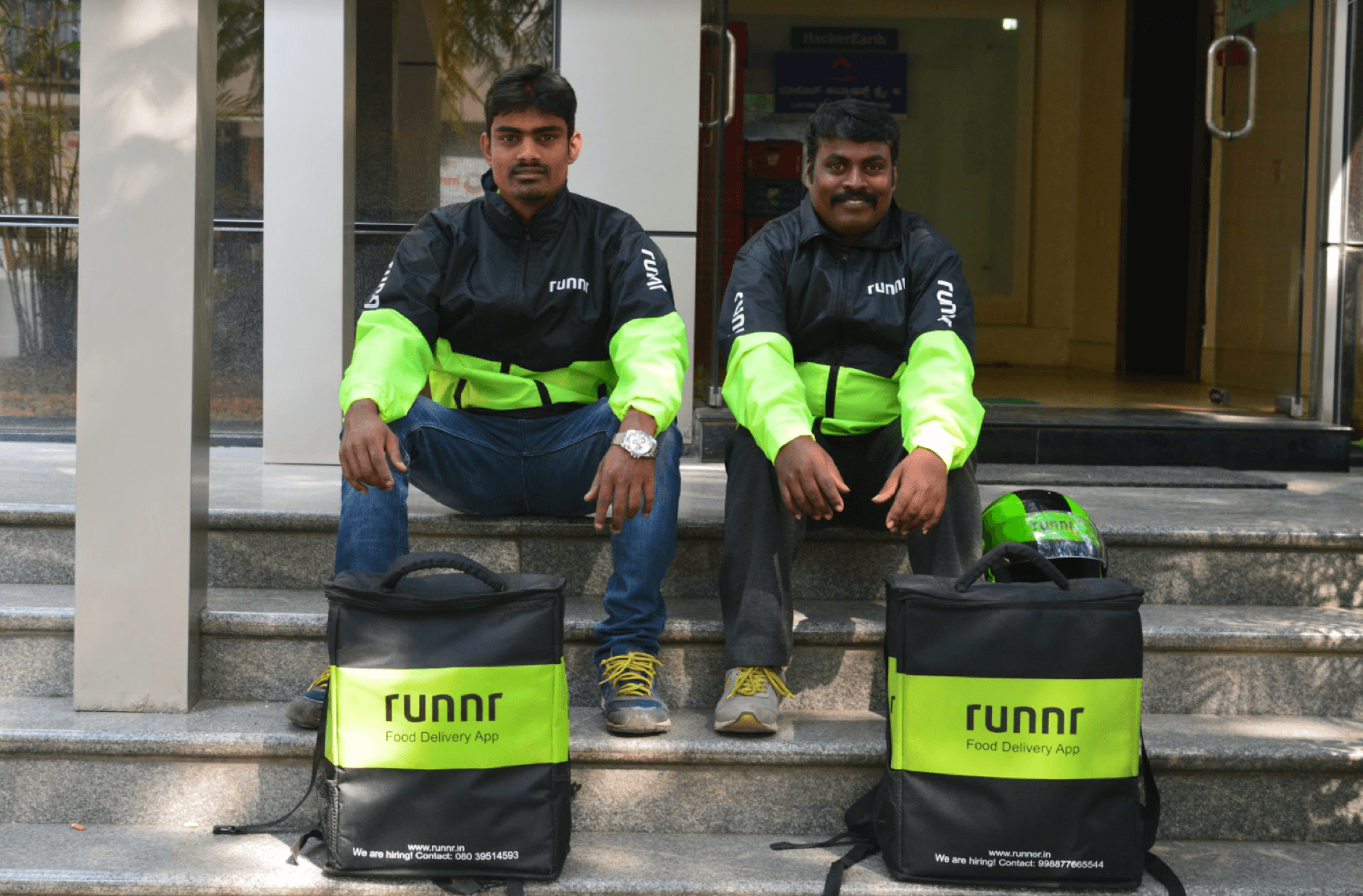
Runnrs- Livery (Biker jackets, delivery bags and striped helmet)
Srinivas, a Runnr, in his uniform.
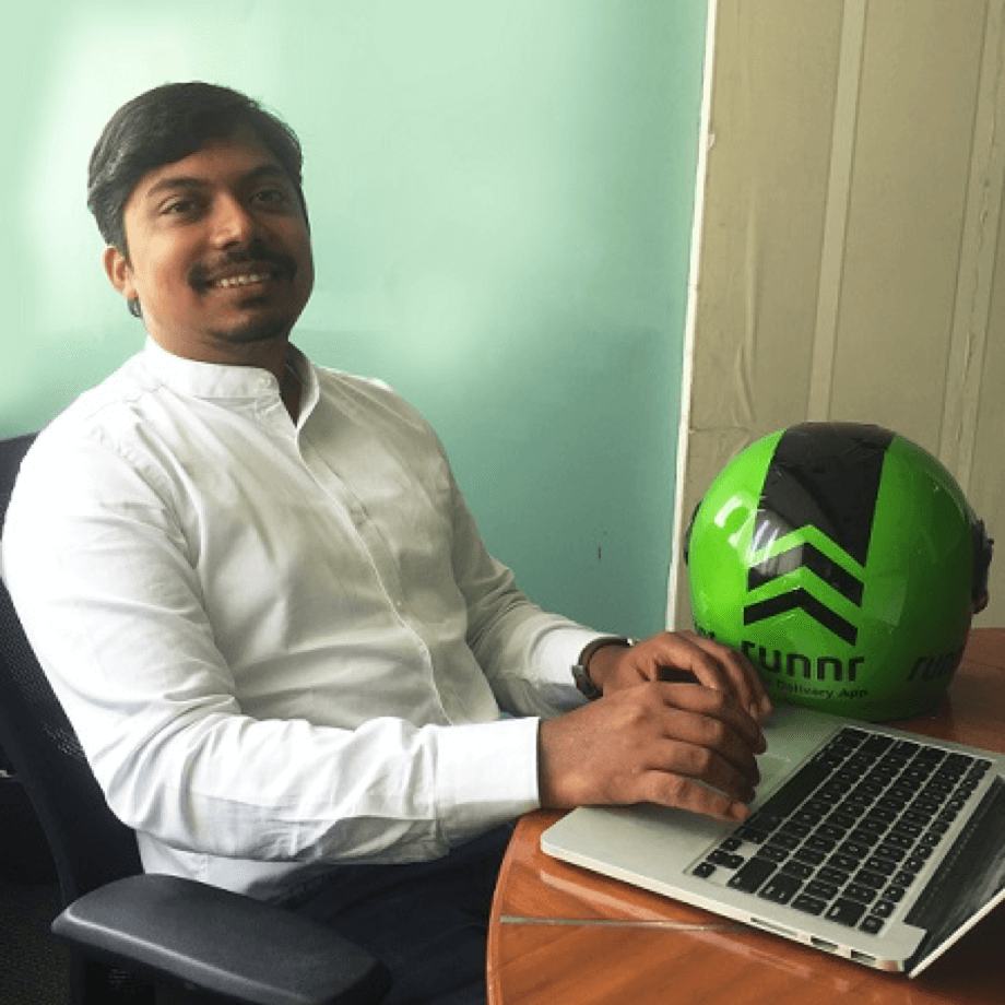
Mohit Kumar, CEO, Runnr, with the signature Runnr helmet
IN-APP BRANDING
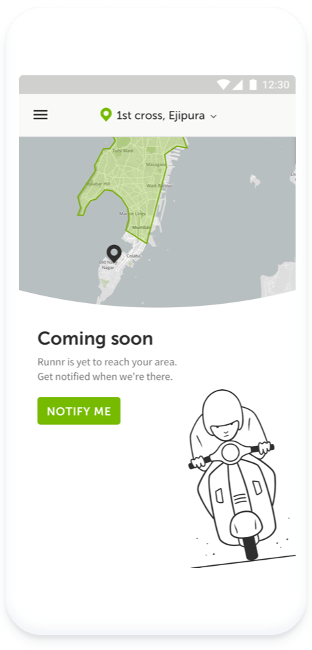
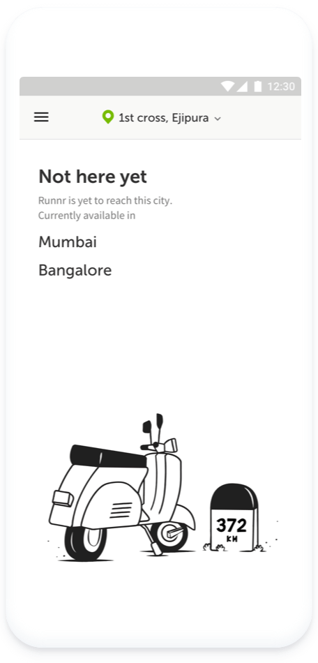
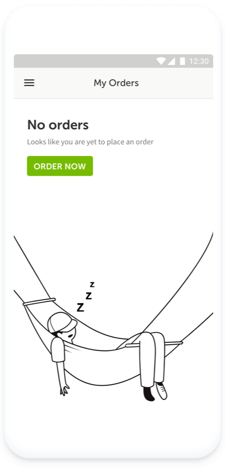
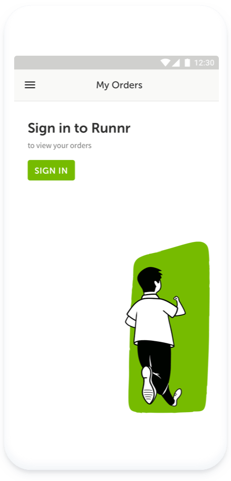
A challenging task while redesigning the Runnr app was to design the error states. While the error states imply deviation from expected behaviour, they shouldn’t however, mean a dead end. A major challenge was to tell a story via delightful illustrations which reinforced the delivery focussed brand.
Brand-Building is a long term commitment for any business. To fully reap the benefits of a brand, it takes at least a couple of years. For the fast changing startup ecosystem, this is a prticularly difficult challenge.
I thouroughly enjoyed doing this branding exercise with the Runnr team. Unfortunately, before we could fully roll out the brand, Runnr was acquired by food-tech giant Zomato in September 2017.
Special thanks to Arpit Dave and Mohit Kumar-the founders of Runnr, for being open to experimenting and providing us necessary support to try out our ideas.
Avik Dey
UI/UX designer based in Helsinki. Ex-design lead at TinyOwl and Runnr.