Clearfunds
Bringing simplicity and clarity to investing.
Clearfunds is a Mutual Fund Marketplace, and investment advisor in India. The robo-advisory platform provides financial planning advice via their web and mobile tools. With the government promoting investment to the masses, the number of investors multiplied many folds since 2015. Clearfunds entered the market at the right time to capitalize on this trend.
The founders of Clearfunds are well-known in the finance sector. Their large network along with some media coverage helped acquire the first thousand customers. Many in this group were well-paid professionals who invested their money in regular mutual funds -- paying up to 1% in commissions every year.
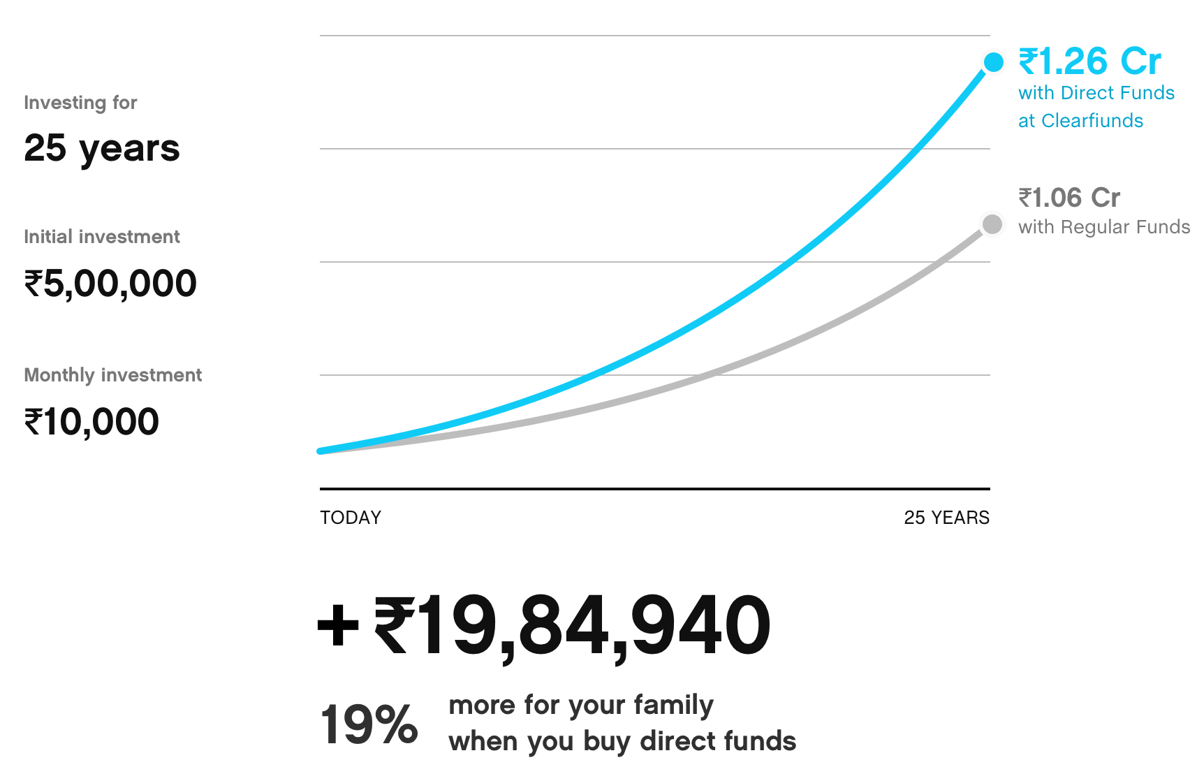
The company's original messaging focused on educating users about hidden commissions they were paying with regular mutual funds. While this was effective in acquiring customers, it did not communicate other qualities of the platform. Through competitor research and user interviews, we identified and reinforced the messaging to emphasize the platform's expertise and trustworthiness.

Illustrations
I developed an illustration style for the Clearfunds brand, which was used for the website, editorials, and marketing campaigns. The primary challenge was to create a theme that conveyed the sophistication of a financial product in a simple manner. To illustrate the concept of small costs compounding over time, I used extra-large elements. The use of characters helped convey the scale and drama while making the brand more human.

Development of Illustration style:
- This style was initially developed for error screens. The team found it too dark and gloomy for an investing platform. Silhouttes also constrained the level of detail. However, it gave us the idea of using bold dark elements to convey negative emotions wherever needed.
- I improved the illustrations with more detail and color. This style too had two issues: First, the colors - though realistic, felt disconnected the Clearfunds brand. Secondly, the character was dressed in a western attire and was hard to relate for an Indian audience.
- I had to develop a fresh color palette for the illustrations. I refined the style further - making the illustration cleaner and flatter while adding more drama to make the characters appear more animated.


Investment Tools
The company's primary goal is to provide superior financial advice to its users and help them invest in the best fund schemes. Through research, we categorized users into three levels of expertise and developed tools to address their investment needs. These tools make it easier invest and manage their portfolio.
Dashboard search and explore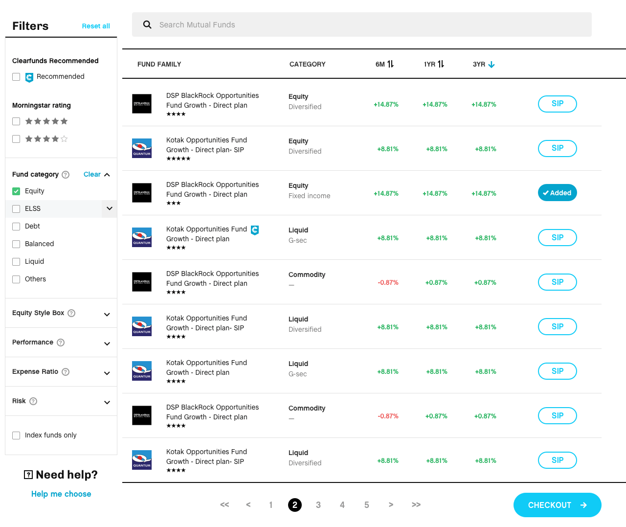
The primary way to search funds. People could additionally filter, compare and buy funds through the dashoard.
Clearfunds recommended
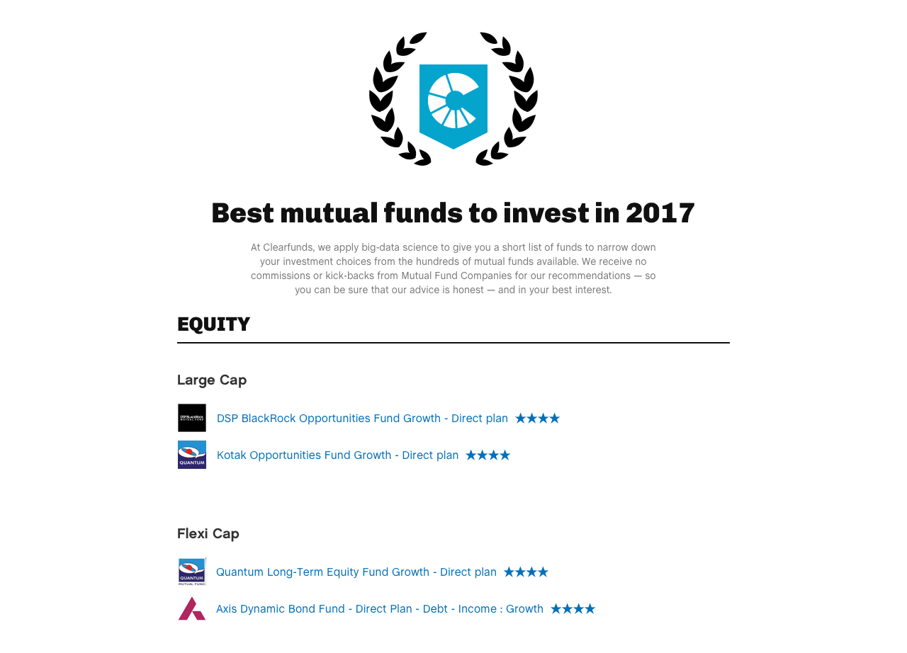
Too many options may feel overwhelming. Clearfunds applies statistical modelling with some machine learning to help users narrow their investment choices.
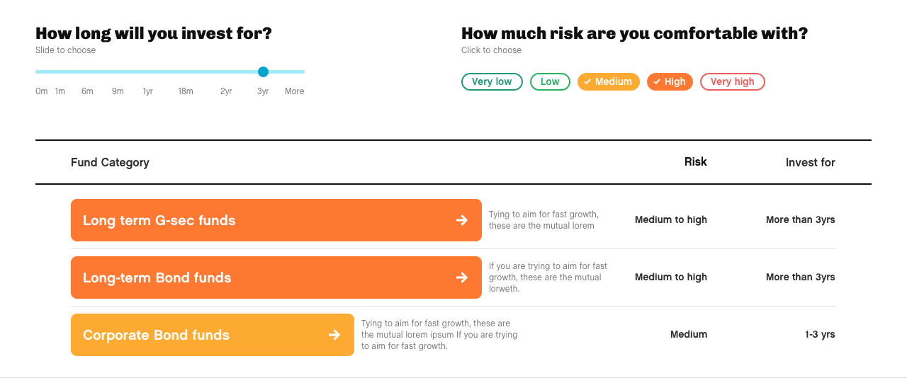
It is difficult for early investors to decide the type of funds to invest in. Fund helper educates and guides users to the appropriate fund categories — based on their time horizon and risk appetite.
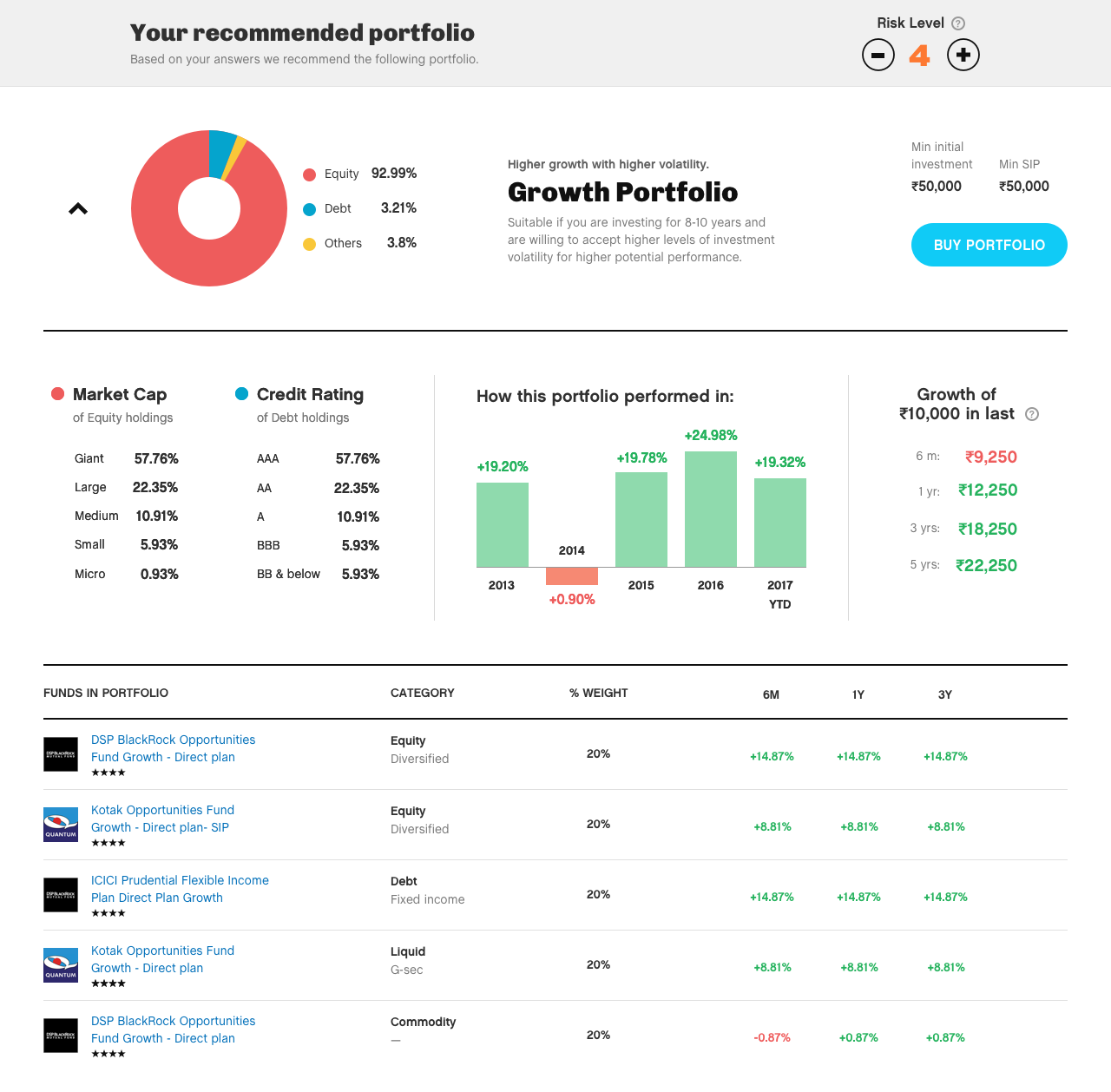
Portfolios are a diversified mix of funds that help maximize returns while minimizing risk. Users answer questions regarding their financial life and their reason for investing -- based on which clearfunds recommends a personalized portfolio.
Mobile Screens
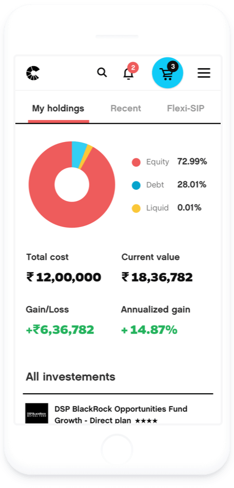
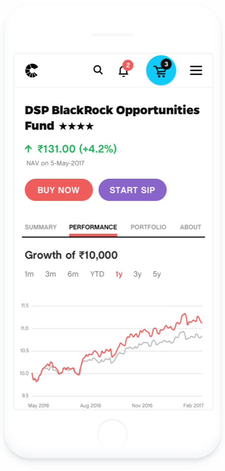
We also developed the mobile experience for Clearfunds. Since the tools and dashboards were data intensive, we followed a desktop-first approach to ensure efficient usage of the real estate. This made it more challenging to visualise the designs for smaller screens. I explored different strategies and optimised the experience to facilitate comparison.


Conclusion
Apart from setting up the design process, the project also improved the team's design thinking. This project helped us bring simplicity and approachability to a complex domain like finance. As a result, Clearfunds saw a 30-fold increase in the number of investors on the platform in 6 months. They was acquired by Indian payments company Mobikwik in 2018.
With no prior experience in the investment sector, this was a challenging but a great learning experience for me. I was fortunate to interact with the managers of leading fund houses and learn from some of the best people in the industry.
A very special thanks the founders of Clearfunds: Kunal Bajaj, Sarosh Irani and Jaideep Tibrewala for their invaluable inputs.