The Safarist
Improving discoverability and engagement for an interest-based travel website.
The Safarist is a community for Safari lovers where they connect, plan trips and travel together - sharing costs and experiences in the process. The community is currently tailor-made for Safari goers, bird watchers, and trekkers but can be expanded to cover more interests in the future.
The platform makes good use of the collective knowledge of the community - experienced travellers share travel information and leave travel tips helping the community plan their travel in a better manner.
After extensive conversations with the founders to understand their vision and identify areas of improvements, I presented a few ideas as a part of my UX pitch.
Upcoming trips
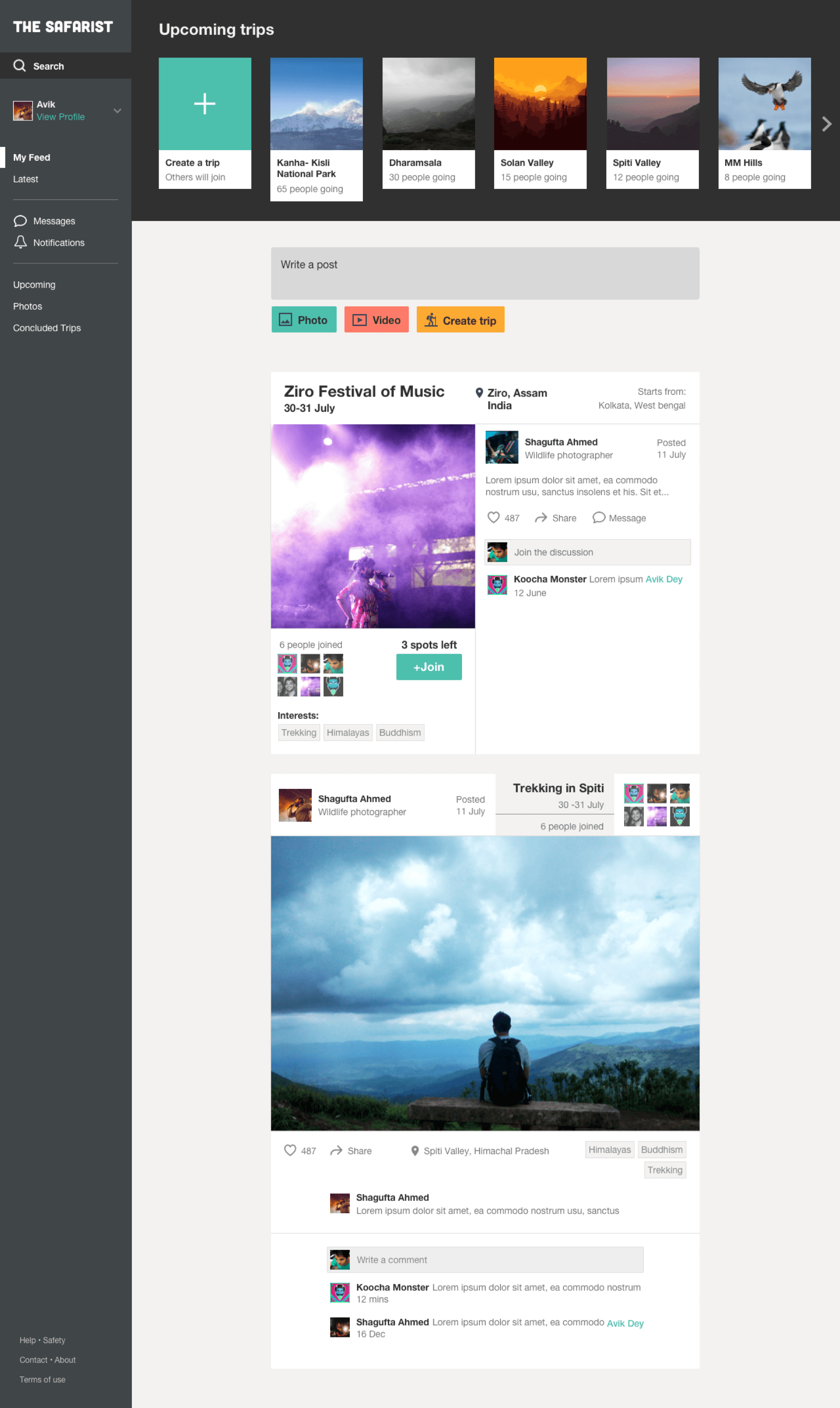
The current website homepage consists of a feed that includes a variety of posts - travel plans, photos, videos, etc. While this ensures variable reward, it inadvertently makes it difficult for users to view available trips in a succinct way.
Since the primary function of the website is enabling people to discover and plan trips together, it was required to clearly demarcate trips from the noisy feed. I achieved this by placing a condensed yet visually rich ’Upcoming trips’ section right on the top of the homepage. It would save users from the pain of endless scrolling to hunt for relevant trips and also enable faster decision making.

Tags
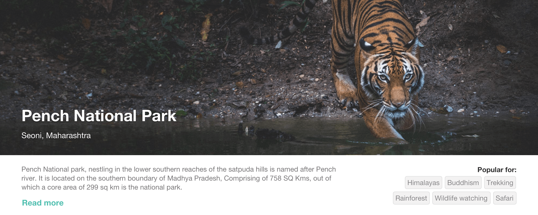
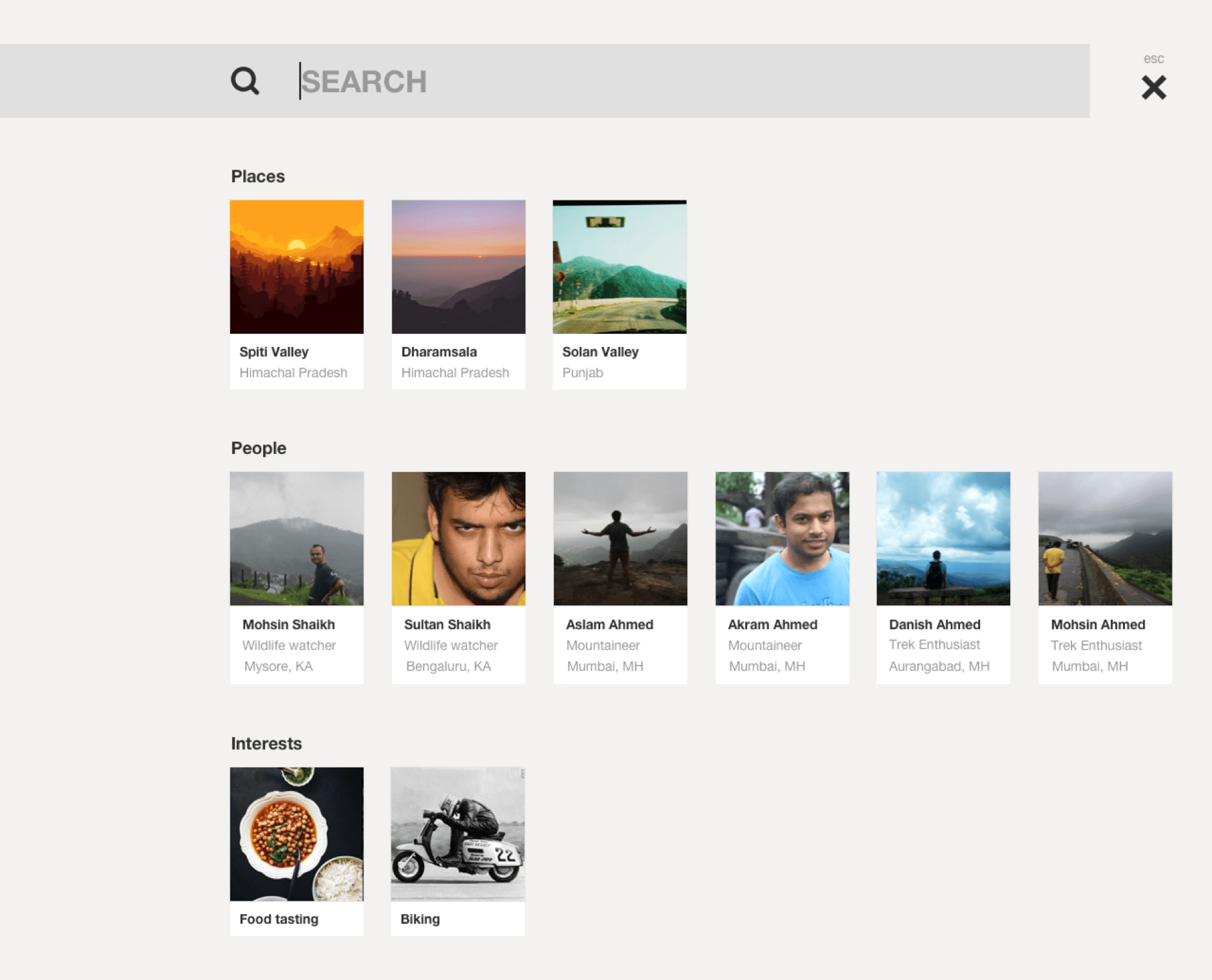
Tags promote discovery by helping us map attributes to content and people. They also enable us to profile people based on interests and build a highly effective recommendation engine. Users can be asked to select a few interests from a set of tags to customise their experience.

In this context, tags can be attributed to trips, events, places and interests to provide relevant recommendations. This helps the community find co-travellers and seek travel advice.
Profile features
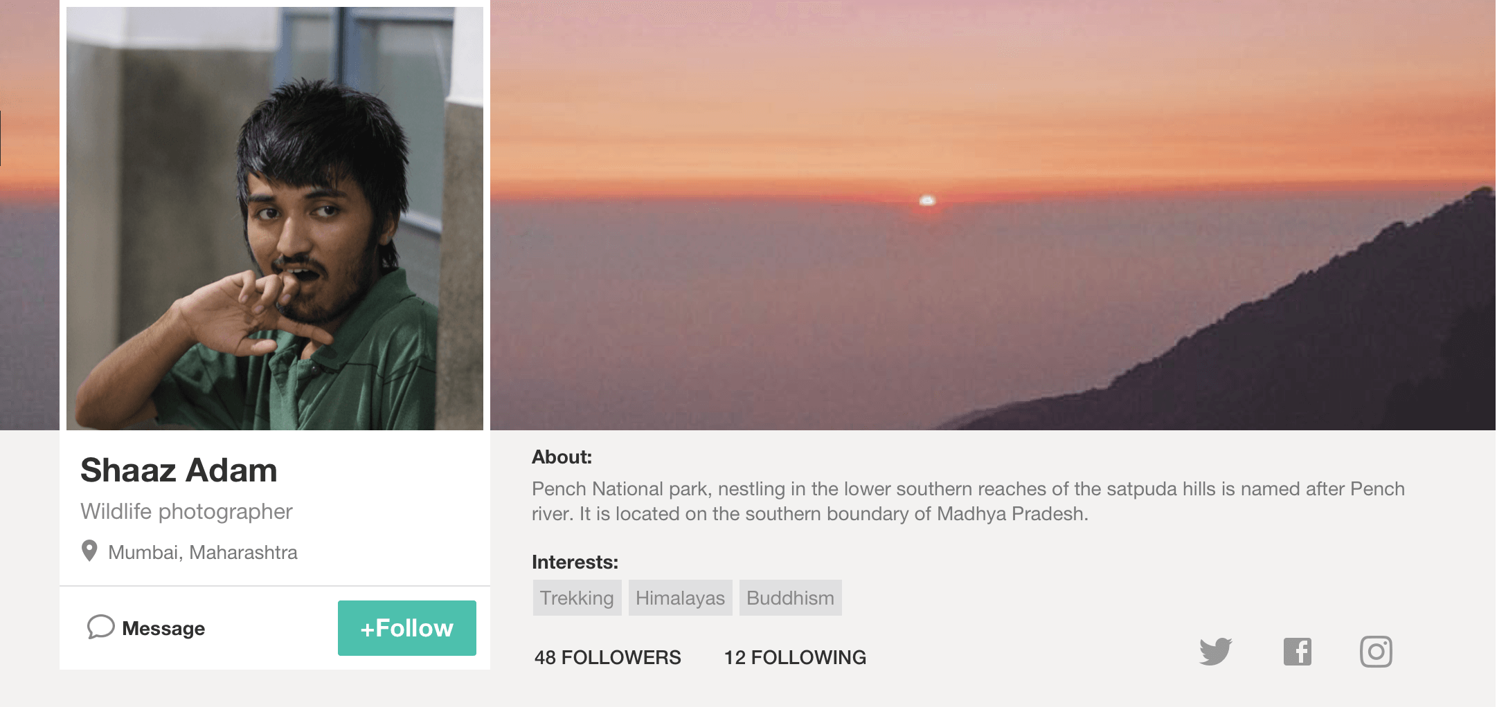
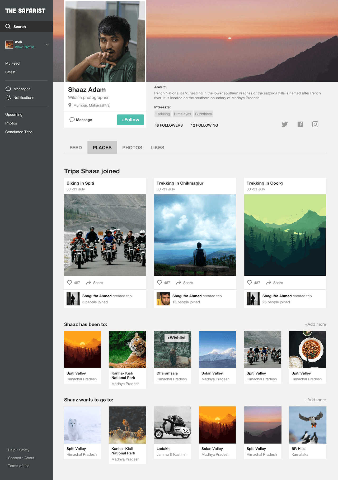
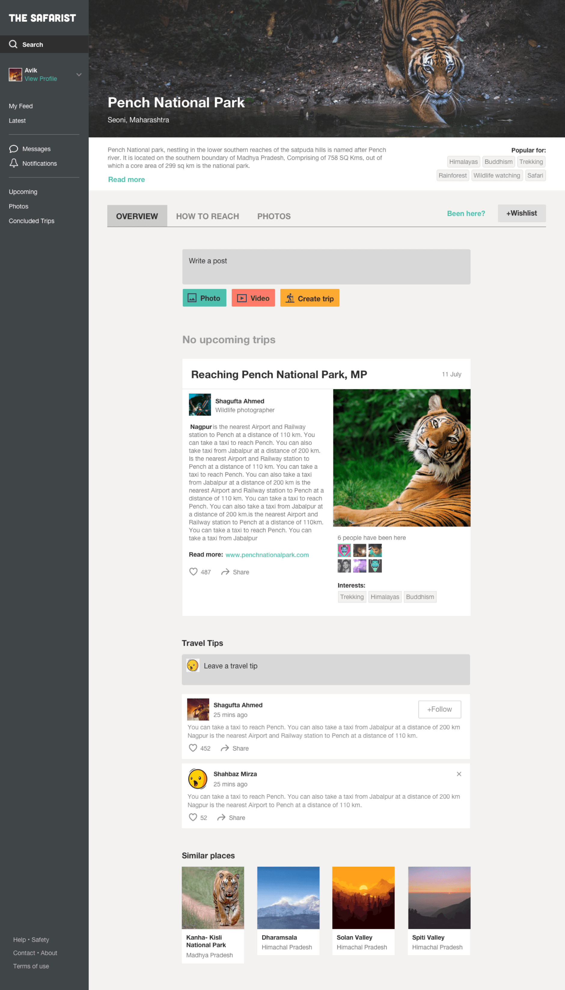
People who travel often usually want to showcase their past experiences. These experiences help the Safarist community to utilise the collective knowledge and help people plan trips in a better manner. People who’ve been to a place can leave travel tips - helping others to know more about a place and hence, plan their trips better. Some details about past trips can be collected at the time of user onboarding - this will help the platform to better profile users and customise their experience.
Travellers also have a wishlist of places they want to visit. Such places can also be showcased on the user's profile. When used along with tags, this makes it easier to provide co-traveller recommendations while planning a trip.
People, not numbers
The website depicts people who’ve joined a trip with just a number. Not only does this undermine the value of people but also limits discovery. People of the Safarist community are full of interesting stories and are more than just a number. Since the platform is built around connecting people sharing common interests, this could be done in a better manner by displaying avatars along with the number. Users can also be allowed to explore the profiles of the participants giving potential participants know more about their co-travellers resulting in better engagement.
![]()
Apart from trips, the same unit can be re-used for photos/videos, putting people at the centre of the experience and consequently, building trust in the platform.
![]()
![]()
Events
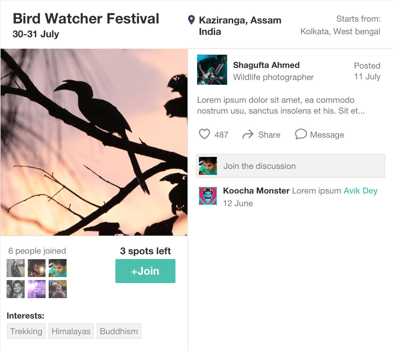
A lot of travellers have little knowledge about events and festivals organised by national parks. Such festivals in India usually have low attendance. Apart from trips planned by community members, such events can be promoted (in collaboration with national parks) and can prove to be successful triggers.
Visual Design
Although I had created UI in the past in adherence to style guides, this was the first time I tried implementing atomic design methodology to my design process.

I translated my ideas - first into atoms and eventually into pages - ensuring rapid UI development. You can find the same in the previous examples. This gave me more time to focus more on UX than the UI.
Luckily, I was able to develop the stylesheet in an very organised manner. It allowed me to create the following pages in a matter of hours. This method not only ensured consistency, but also eased the decision making process while designing.
Future Scope
Gamification
The Safarist can virtually reward contributors through badges, milestones and achievements. Introducing gamification will also help achieve better engagement as people will be encouraged to invest in the platform.
Monetization
The platform can monetize by allowing people to book travel tickets, cabs and places to stay on the platform. Moreover, tickets for special events like festivals, etc. can be sold through the site - providing the users a holistic experience.This was a great exercise in visual design for me as I approached the problem more methodically and created a scalable design system from scratch. Unfortunately, due to shortage of time and budget, we could not go ahead with the proposed direction.
